

I wireframed an e-commerce website for a brand who has only physical locations. Here’s the story.
Meet Flying Tiger!
This quirky modern gift shop from Copenhagen has 900+ stores worldwide. With something for everyone, they offer a sense of play and silliness with useful products for ages young to old. They have a website which doesn’t currently include e-commerce.
Project Overview
User Research, Card Sorting, Competitive Analysis, Sketching, Usability Testing, Wireframes
Tools: Axure, Adobe Illustrator, Optimal Sort, Sharpie and paper
Duration: 2-week sprint
Problem
Users need a way to shop online for Flying Tiger, because not everyone lives near a store and others desire immediate convenience.
Hypothesis
I believe by restructuring their current site to accommodate e-commerce, shoppers will be able to easily purchase at their convenience.
I will know these efforts are a success when Flying Tiger’s profits, customer retention, and social media mentions are at an all time high.
Discovery
I went to Flying Tiger’s nearest retail store and took a whopping 100 photos of a wide range of their products. I saw many useful items with great design. The major challenge was to identify categories for the site’s Information Architecture. Here’s where my users came in handy!
User Study: Open Card Sort
Scope: 100 photos taken
Participants: 9 people

Competitive Analysis
Let’s face it, many gift stores have similar online shopping experiences. Keeping this in mind I set out to convey Flying Tiger’s brand personality. It was key to find features that made me go ooooohhh! My research informed me there are two types of shoppers; those who know exactly what they want, and the casual browser.
Below are key takeaways that informed the gift finder feature that I designed for Flying Tiger.

Sketching
I dove into the Information Architecture for my e-commerce site with tons of ideas. Sketching them out helped map out the experience for the shopper. It also assisted in narrowing down categories, informing the type of navigation to use, and helped me in choosing a layout. Here are a few of my most informative sketches.
Beginning Home Page
Shopping Cart Sketch
Gift Finder Ideas
Know what matters to the brand
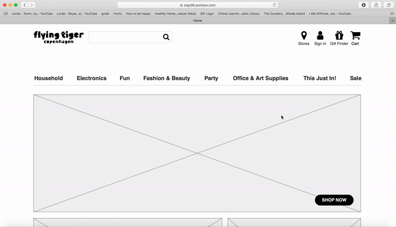
Flying Tiger clearly takes great pride in their new product releases. With the #1 spot in their current site’s navigation I gathered that new releases are a prominent focus. This drove my decision for the “This Just In!” category on the top nav.
A seamless experience for shoppers
I set out to create a shopping experience that would be clear and useful to both types of shoppers: “I want it now” and “just browsing”. Fast shoppers go directly to a site’s search bar. Curious shoppers browse categories, searching for a fun gift.
Creating a gift finder
I created this useful tool to relieve pain points from shoppers looking for a perfect gift. Shoppers can select a recipient type, age, price scale, and hobbies or fun motifs, such as llamas! One of my user study participants was a loving, obsessed dog mom. Taking the experience a step further I included an option to find a gift for your pet. Furry or not, they are a part of the family too! “Woof” “Meow”
What to call toys for ALL ages
Version 1 listed “Toys” as a top navigational category. As I got to know the brand, I learned several of their games are for all ages, and updated the category to “Fun”. Many office items have a creative factor, which lead me to expand this category to “Office and Art Supplies”.
Usability Testing
Users had mostly positive feedback. They appreciated how clean the site is- black and white with only small pops of color, and the quirky features that made it unique. People found it simple to use with no major hiccups or confusion. Many users expressed an interest in visiting Flying Tiger themselves!
Let’s go Shopping!
Picture this.. you have a playful wonderful mini human, yes I mean a child! He/She hates brushing their teeth! Today we are looking for fun accessories to spruce up our bathroom.
Let’s find a gift, the FUN way!
This feature was built for casual browsing shoppers to find the perfect gift!
Final Thoughts
I really enjoyed creating a fun and useful digital shopping experience based on user data. Early on I noticed users were giving the same answers to what they wanted in an ideal shopping experience. Knowing the brand is fun and silly, pushed me to explore ways to make this experience different from other stores. My organization and thought process throughout this project helped me move forward quickly; testing my assumptions with users along the way. It was the tip of the iceberg in creating a fun and engaging e-commerce experience! I’d love to explore this further, and learn more about what excites shoppers in future projects.

