Sales Research Automation - trender.ai
TL;dr We designed a search engine to automate sales prospect research, saving 2+ hours of manual research per prospect.
Context
Background
Beginning in Spring 2022 our team strategized a redesign for our search engine for social media.
Shorten TTV (time to value), user retention, market traction
Business Goal
Research, strategy, and feature design for new search input based on user feedback. Problem solve ways to reduce the time it takes to initiate a search. Ensure highest quality search results that bring value to users.
My Role
Oh you can’t wait?
Integrations weave SaaS apps into a user’s daily workflow, lightening the barrier to adoption.
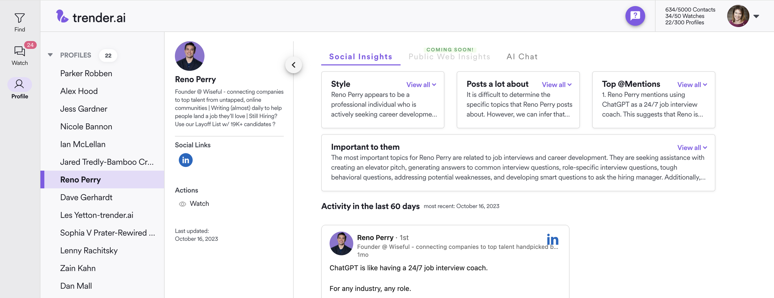
Solution: Trender.ai’s Chrome Extension (V1 released Fall 2023) aligns with innovations in industry-leading sales technology applications. After several iterations, users are obtaining dossiers with AI insights for each prospect in their sales funnel within a few clicks.
👇 Demo below
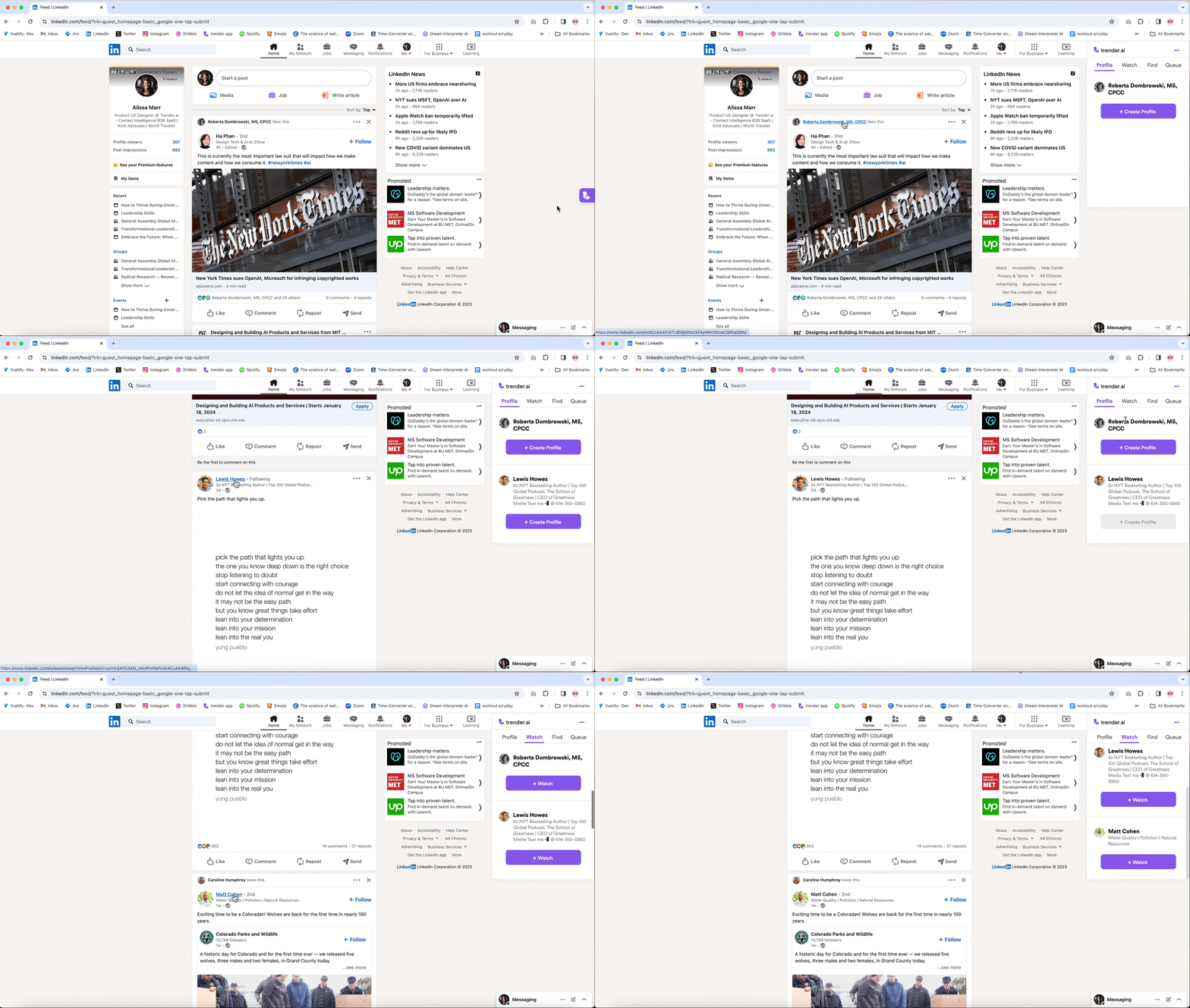
Open chrome extension, hover over a name, instantly use trender’s prospect profiling tool.
Project Overview
My role: End-end Product Designer
My Team: UX Research by VP of Product, 1 FE Engineer, 2 BE Engineers, 1 ML Engineer
Duration: Spring ‘22 - Fall ‘23 (Multiple iterations)
Deliverables/Tasks: User Personas, Competitive Analysis, Design Thinking, User Flows, Storyboards, Sketches, High Fidelity Prototypes, Google Chrome web store graphics
Contact intelligence saas
Proprietary AI algorithms scrape the internet for public web and social media posts authored by or @mentioning a person or company.
Users are typically:
Sales Reps
Business Development Reps
Marketing Managers
Small business owners
Both technical and non-technical
Initiating a Search
When I started as Product Designer, searches initiated through this awful form 💩.
UX audit findings:
Weird terminology
Little explanation/direction
Too many fields
👥 Many users left the form causing low conversion rates.
Hick’s Law: increased number of choices increases decision time.
We set out to redesign the search experience!
MVP design (not me)
Google for social media?
Iteration 1: Search Bar
We hypothesized the familiarity of a search bar would help a user’s mental model.
I came up with the below design by examining at how other apps initialize searches or personalize results depending on a user’s preferences.
Search Bar: Facebook, Instagram, Google.
Step-by-step Surveys: Reddit, Dating Apps, workout apps.
👎 Result > Users entered names or keywords which were not closely related..
Our AI model returned poor quality social posts. Users imagined a feed of super high quality posts, but since our AI algorithm was confused, they got watered down results.
Search bar design with CSV import and Search setup wizards
👥 What users thought
The design looked like a search bar, so users understood its use. But unfortunately it put too much trust on the user.
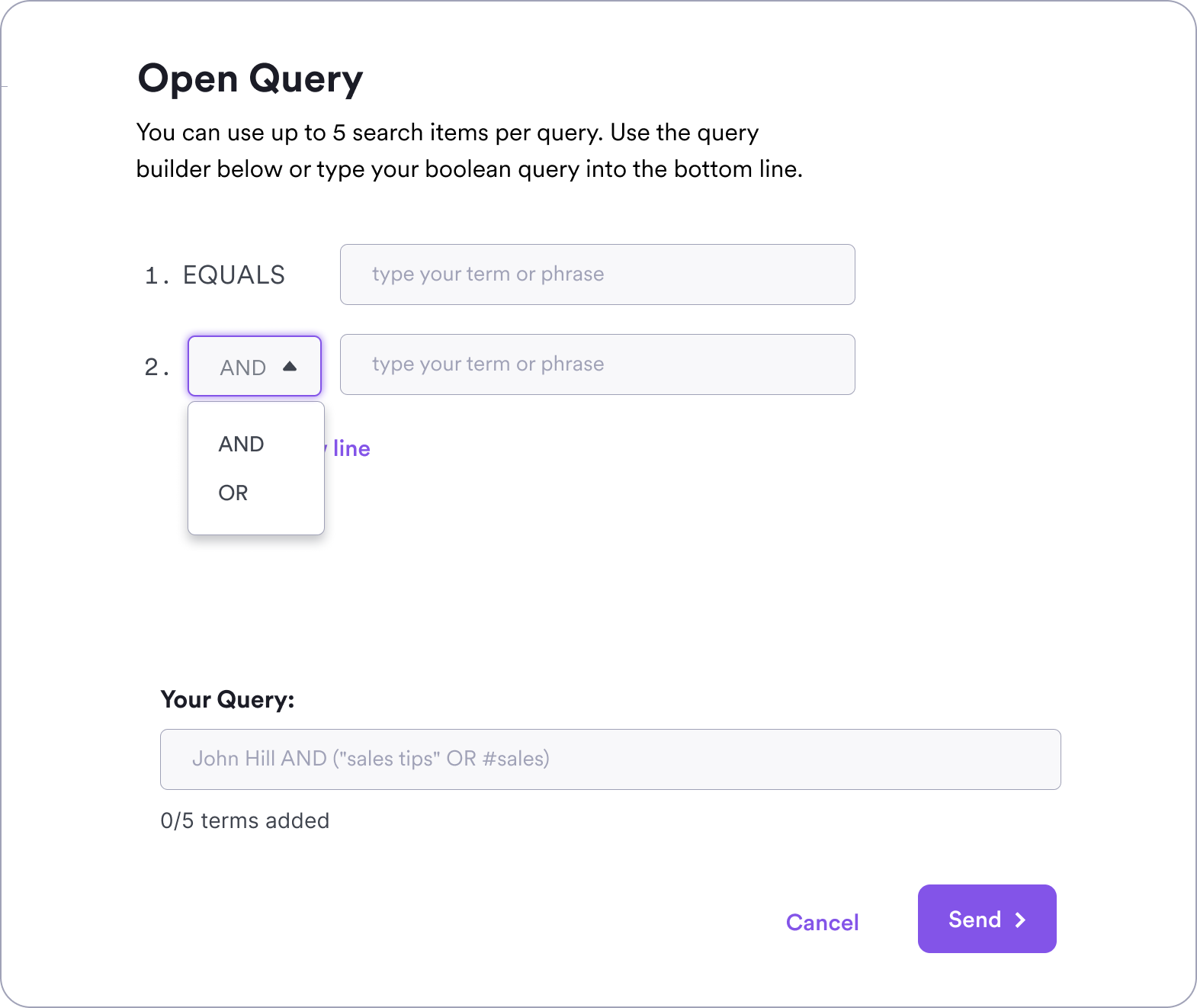
Usability testing showed not many users understood it was a “boolean-like” search bar.
As a Placeholder solution, we added an onboarding video to explain search strategy. This increased usability by 10% and bought us time for another cycle of research and design iterations.
Getting more specific
Iteration 2: Company or Contact Specific
Very specific fields with ONLY the company or contact name made trender an obvious tool for sales prospecting.
👋 Result > Streamlined prospecting simplified choices!
But users claimed it is too much work to manually add all this information. (and we agreed.)
Step 1: Search for company or person
Step 2: Fill out Contact details
👥 What users thought
Chatting with users revealed the setup time was too steep.
Users understood but the experience was still bad.
⚠️ Mistakes were made
To be transparent, I’ll share some design duds.
While some of these are bad looking back, we sincerely thought this is what users wanted. Users asked for CSV but rarely used it. Advanced search boolean was also widely asked for.
Something you come to realize as you are on the cusp of innovation, users don’t know what they want.
Searches created from a CSV file. 👎
Guardrails: helping users strengthen their results quality
Boolean Search
—Crucial career learning: After months of iterations I found out were were missing something big.
We were NOT aligned with the industry standard in innovations.
Must-Have Google Chrome Extension
A small software program which adds functionality to the browser.
Integration
Sends data with few clicks
THIS was the standard integration. AND this became our route to quality searches. 🎉
make it instant
Iteration 3: Enter the Chrome Extension
Manual entry? Nope! We took inspiration from Apollo.io and designed our own Google Chrome Extension! This now works inside LinkedIn and LinkedIn Sales Navigator, (future is Hubspot).
Our Google Chrome extension puts minimal effort on users. Roll-over names and click to place 20+ companies or contacts into the trender.ai queue within minutes!
🙌 Result > Streamlined prospecting, woohoo!
trender.ai Chrome Extension - Rollover names, companies, it even works in the comments!
Screen design flows from V1
👥 What users thought
Users were psyched!
B2B Sales teams are in LinkedIn all day. Trender became part of their workflow.
The Chrome Extension made trender.ai competitive against industry leading sales tech SaaS apps.
Wait, there’s more!
As an AI SaaS, we need to communicate algorithmic nature and limits to set realistic user expectations.
We switched to the term “watch” instead of search. A person’s mental model for the term “search” believes they will receive immediate results. Trender processing time varies.
Teach users and set expectations
Several improvements helped users understand “watches” and their limitations.
First-time message about how long it takes to get results.
Processing queue. Users can see that yes, their watches have started.
Clear in-app feedback.
New content Email/Slack alerts.
In Reflection
Utilizing competitive research from industry-leading sales tech companies further along than us, like Apollo, is crucial. In order to innovate I need to always be aware of the current level of innovation in sales tech.
Too many choices leads to bad choices. I learned that users want to know exactly what to type into trender. We originally thought that giving flexibility on what to search for was ideal, but quickly found it was too hard.
It can be tricky to find a balance of over explaining vs not enough feedback when designing an AI app. We now assist users heavily with explanations on what is going when they press send. Full transparency clears frustrations and users won’t think the app is broken 😂.
